Wednesday, 13 April 2011

Evaluation.

Evaluation.

Within this essay I am going to do an evaluation of my music magazine coursework; the front cover, contents page and double page spread. This is the brief we were given; main task: the front page, contents and double page spread of a new music magazine. All images and text used must be original, produced by you – minimum of four images

My magazine was designed to keep in keys with certain generic conventions of  a music magazine such as the masthead, banner line etc. appearing in the expected positions of the front cover but also to challenge others aspects. My intention for the magazine was to be individualistic and aesthetically pleasing for the reader especially in regards to the front cover as this would be the first thing a possible buyer would see. I intended the front cover to contain bold, block colours and for the font styles to be unique and eye catching. For the contents page, I followed a similar layout to that of Kerrang magazine because it was simple and effective. The image being used as the divider on the contents page enables to reader to digest all the information on the page with ease. The double page spread met with the generic conventions of a double page spread. This is because half the page was devoted to an image of Katy K, the other half to the interview I devised.

My media product aims to represent my social group (C2 D E) by having a model on the front cover who represents that social group. For my magazine the social grouping it was aimed at was students from a C2 D E socio-economic background. I believe my model echoed such a grouping as she was dressed in a similar way to people of that background dress. The model is not wearing designer brand rather simple, fashionable high street clothing. I made the magazine of reasonable pricing (£2.99) meaning those from such a background can afford it. The fact it is a lower priced magazine means it could be issued as a weekly magazine. However due to the contents of the magazine it would be more effective sold as a bi-weekly magazine. This would mean that more people would buy it more regularly because of the fact they could save up to buy the magazine. A magazine of £2.99 will be of good quality paper and full of quality stories and images.  Also the stories featured are ones in which the social group would be interested in. All images used in the magazine where of young people of a similar age to that of the intended target audience. This creates familiarity between the reader and the magazine as the reader can relate to the featured artist.

I believe an institution such as Bauer would distribute my product. This is because Bauer distribute Kerrang!, Empire, Kiss and Q. These magazines hold similar ideologies and values to that of my product as both aim to be individualistic and contain alternative music within them. The above magazines have similar target audiences to that of my magazine Download and they all fall within the same price range. Bauer would be able to provide the necessary advertising within the magazine for certain products to enable the magazine to really take off and be successful.

The audience for my media product would be students from a C2, D, E background and I believe this intention is echoed in the use of the images and stories featured. I choose such an audience because that audience is the greatest majority that would buy such a magazine. Also it is a similar background to my own meaning it would be easier for me to create a product that appeals to them because I know what such an audience may desire. After looking at the reader profiles of other magazines such as NME and Q, both existing indie magazines, I realised that the readership profiles show they have a greater male audience than female. It is for this reason that I decided to make my magazine conform  to existing magazines and follow their conventions. On the front cover of my magazine I included all the necessary elements needed on a front cover such as banner headline, price, barcode etc. I ensured there was a house style which was evident throughout the 3 pages. The idea of a house style is a generic convention of music magazines. For the contents page I tried to move away from the conventional layout of a music magazine. I chose the layout I did because it was clear and looked professional. It adhered to the house style of the magazine. The double page spread was initially intended to be an introduction to the actual article. By this I mean that the image was intended to take up the majority of the page with a small amount of text on it. However it was easier to divide the page into two section, the first side being devoted to the image, the second to the article. This layout is generic with music magazines.

Through the images I used, the house style of the magazine and the stories featured I believe I attracted the desired audience. The price of the magazine is relatively cheap meaning this became another factor that would attract the desired audience. The house style of the magazine is bold block colours echoing the style of NME magazine. This magazine has a similar audience to my intended audience meaning that  wherever possible I aimed to follow their codes and conventions. This would ensure that my magazine would appeal to the target audience.

During the process of making this magazine, I have developed my skills of working with Photoshop editing software. I have learnt how to successfully manipulate images in order to create the desired affects as well as placing a certain image on a different background and still make it look as if this was the original background. I have learnt how to place text and other images on top of an initial background image creating the required magazine effect. Some issues occurred when using masking in order to manipulate one element without other elements being affected. Initially I struggled to isolate an element of a photo for example the model herself in order to manipulate the background but through practise I over came this error. Overall using Photoshop made my work look more professional which was the desired result. To present my work I used Blogger. Blogger was designed to post images, text etc. onto the site. Because of this we found it a useful tool for presenting our work. The only issue I found with this was that once you posted an entry you couldn’t move that post around. For example if I posted an entry about pricing but forgot to post an entry about readership figures, I could not post the latter in isolation, rather include it in another relevant entry. To take my original images, I used a Fuji Film digital camera. Using a professional digital camera enabled me to take good quality photos and also adjust the colouring and lighting on the camera itself. Also using a good quality camera meant I had to do minimal manipulation to the image in regards to the quality of the photo.

I believe I have been able to manipulate images using more successfully since I created my initial college magazine. The product looks more professional and looks as though it could be published in store. The contents of the various elements are also more professional as they adhere to the conventions of existing magazines such as Kerrang! and Q. I have grasped a better concept of the 5 elements each magazine engages with. These are the language, institution, ideologies, audience and representations. Having bettered my knowledge of these key concept, with my final product I was able to relate these to my magazine in order to make it more appealing to the audience and also look more professional.

Changes made to each product.

In response to my audience feedback the above is the changes I made to my front cover. I believe this new cover adheres more to the conventions of an Indie music magazine. It looks overall more professional and the house style is more effective here as it is bold and engaging.


My audience feedback showed me that out of the 3 drafts and the 'final' copy of my contents page, it was my initial draft people liked more than the 'final' copy that I has made. It is for this reason that I made a few minor alterations to my contents page and have decided to use this as my final product.


My audience feedback to my double page spread was overall positive. The only issue really address was the fact that the text would be scwed by the fold in the double page spread. This meant I had to rearrage the collums for the article as well as the blurb for the story. I added a call out from the article as a focus point for this page.

Response to audience feedback

After reading the audience feedback I realised there are a number of changes I must make to each element of my magazine. The front cover needs drastically changing. the image does not link to the other two images and overall it does not look as professional as I would like it to look. I am going to use my first draft design contents page as opposed to my initial 'final draft'. According to the audience feedback, this design was better than my other drafts. In regards to the double page spread, I need to move the text to avoid text being lost when folded into the double page spread. :)

Audience Feedback

Audience Feedback on my Front cover, Contents page and Double Page Spread.

1.      Front cover – I really like the layout. It’s simple yet effective. The fact the model is making eye contact with the audience caught my eyes. Perhaps vary the font styles used on the front cover?
Contents Page – I really like the way the page is split into two sections. The image is a bit odd though. Not sure why! I was looking through your drafts though and I really like your initial design. It’s more effective than this one I think J
Double Page Spread – LOVE IT! The font styles are really fun. Only issue is that surely if this is a double page spread then the writing in the middle of the page is going get cut in two?

2.      Front Cover – The image grabbed my attention, as did the subtitles. The title font is eye catching and reflects popular magazines. I found the white text less easy to see and therefore read. Perhaps embolden the white text or consider a different colour or font.
Contents Page – The style is completely different and I feel harsher on the eye. The images are lost in the overall effect. The text blocks at the bottom distract from the images. T different font and subheadings might be softer on the eye.
Double Page Spread – I like the overall visual effect of these pages. The image draws the reader’s eye. I feel that the use of sub headings helps the reader make choices about what to read. Although the font is quite small and would perhaps benefit from being a little larger.


3.      Front Cover – Visually, this front cover is very appealing. The image is engaging to the reader however compared with your other two images on your contents and double page spread, it doesn’t look like they all came from the same magazine.
Contents Page – The image isn’t as good as it could be. The overall effect is good but the visual effect is lost with the pictures you have chosen. Perhaps a clearer image would sort this out! I think your initial design for the contents page is better though.
Double Page Spread –I love it! Such a good effect! The fonts you have used really echo the playful style of the entire magazine. Its really cool and I cant think how to fault it
J

Websites and house styles

Music magazines always contain a house style. This house style is continued throughout the magazine and onto the magazines website. Q magazine is a great example of this.


The font and house style used on this fornt cover is used on every front cover. The blue, red, white and black is carried on through out the magazine.


The house style is continued through into the contents page which is a convention of most music magazines.


It is only when we come to the double page spread that the house style is not as obvious. The house style is still there but it is not as obvious as with the other two pages.

Even on the website, the red and black theme is continued. It is a generic convention of magzines to have a house style. I need to adhere to this convention and include it in my products.

The reason I included this page here is because, with my 'final'copies, one element I over-looked was the house style of my magazine and whether this was continuous throughout all my products. The changes I make need to adhere to the ideas of the house style.


Response to first draft check.

We where asked to hand in everything we had done so far on our blog for marking.
Upon the return of these grades I had a number of changes to make to both the blog and the products themselves that I found necessary to implement.

Saturday, 12 March 2011

Final Double Page Spread

This is the final version of my double page spread. I manipulated the background in order to make Katy K (the model) stand out. The various type faces are good because it makes certain elements of the article stand out more. Only part of the article is on this page, in the full magazine this would be the introduction page of the story and it would continue onto another double page.

Friday, 11 March 2011

Double page spread draft 2

This layout is simple which is effective as it focuses the attention of the audience on the intended elements ie. the article. The issue with this layout is that the image is slightly blurred. Also it doesnt exactly tie in with the house style of the final front cover and contents page due to the type face used for the article title.

Thursday, 10 March 2011

Doubl Page Spread draft 1

This is my first draft for a double page spread minus the inclusion of the article. I have decided that such a layout is effective for a number of reasons. Firstly it keeps in theme with the house style of Download. Secondly, it is clear and easy to read. The idea behind this layout is that this will be the introductory page for the interview with the actual interview or story occuring on the following pages.


Final Contents page

This is the layout I decided to use for my final product. 

Tuesday, 8 March 2011

Contents draft 3


I decided to see what a double page spread contents page would look like. This is what I came up with. The largest image is a continuation of the front cover image. The regulars and features are clearly set out and the smaller image of the front cover on the contents reminds the reader of the main story for this issue. Overall it is clearly set out and again the varying text types echos the idea that this magazine is indivudualistic and youthful.

Monday, 7 March 2011

Contents page draft 2


This layout is effectivte because the front cover model is central on the contents page also. The necessary information is listed below the image. The various typeface used allows the eye to travel over the page and absorb all the information on it. For my final copy I will use the masthead font and a smaller image of the front cover to enable continuity from the front cover.

Thursday, 3 March 2011

Contents page draft 1

This is my first draft idea for my contents page. I like the simple layout with the various typefaces. It is easy to read which is key to the audience being able to navigate around the magazine and I believe it contains the right amount of information against images. I really like this layout and will strongly consider this layout for my final draft.

Wednesday, 2 March 2011

Final Front Cover Design!

This is my final design for the front cover of my music magazine. I have designed it in a way that appeals to the target audience as it is simple and without fuss yet still has the necessary features and information that is required on a front cover. The image connotes the unique attitude I intended to portray in the magazine and the fact the model is making eye contact with the camera create a connection between the magazine and the reader. The masthead is written in a graffiti style which again echo's the ideologies of the magazine. All in all I have decided that this is the layout of my final front cover because it looks professional due to its layout and is fairly simplistic which will appeal to the target audience of teenagers.


Thursday, 10 February 2011

3rd front cover design


I like the layout of this design although out of the 3 I have made this is the weakest I have made. The type faced used for 'from teenage dreamer too...' is effective because it connotes the teenage attitude I wish to present in this magazine. My next step is to combine elements from all 3 front cover designs to create my final front cover design.

Monday, 24 January 2011

Front Cover Design

I felt that the positioning of this photo whole create an effective front cover image as the artist 'Katy K' is just off centre meaning your eyes are drawn to it. However the lighting on this image meant that effective editing was difficult to undertake especially if you wished to edit the background and change its colour. The over all feel of the front cover suggests it is alternative due to the editing on the masthead 'Pazaz' as well as the band names. These are two elements I will take to further design ideas. I do still feel that the page is quite empty which is an issue I need to overcome.

Monday, 17 January 2011

Front Cover Designs


I like this design as its clearly set out and features all the necessary elements a magazine front cover must have such as barcode, date, price etc. However the type face used for the banner headline 'Kathryn K' is not as appealing and eye catching as it should be. Also it seems a bit empty on the page, but i must avoid making the page too busy all the same.

Thursday, 16 December 2010

Photo shoot


These are the most ideal photos taken for my music magazine. The model featured in these images is the 'artist' I will use for my front cover image and double page spread image. I shall also include at least 1 smaller photo of her on my contents page.


 This image is simple yet effective. The close up makes the image extremely detailed however the fact the model is looking away form the camera is unconventional for a magazine.
I really like this image. The model is looking straight down the camera lens meaning that it creates familiarity with the audience. The slight smile the model has creates a sense of mystery which entices the reader to pick up the magazine and read more.
I think this image conveys a sense of playfulness that would be more likely to appear within a more pop related magazine as opposed to an indie magazine. It is for this reason that I will not use this image in my final products.
This image conveys a similar sense of playfulness but the attire and body language of the model gives it a bit more edginess. The issue with this image is that it has a lot of blank space on it. this would however make it appropriate for a double page spread. I may consider this image for this element.
As a whole I really like this image. It goes against conventions which is an element often found in Indie or Alternative magazines. It would be more suitable for a poster pull out as opposed to a front cover, contents page or double page spread image.

Again this image would be more suitable for a magazine as the model is central. Her attire suggests an indie musician and the fact she is looking away from the camera would entices the reader to pick up the magazine in an attempt to find out what she is looking at.
This image does not convey the indie attitude I wish to be present in my magazine. It conveys a playfulness and would more likely to be a holiday photo. It does not convey the professionalism I wish to convey.

The positioning of the model in this image is good for a number of reason. Firstly a sense of intrigued is created and secondly the overall positioning means it would be suitable for a double page spread.
I really like the connotations of this image. As a whole the image conveys a sense of rebellion and individualism. These are two ideologies intended within my magazine. This image would be useful for the front cover.
The eye contact made with this image is striking and eye catching. The fact that the eye make up on the model is dark only intensifies this effect.
This image is lovely. The lighting focuses your eyes on the models eyes. The make up used defines and outlines these features creating an elegant look. The coiffed hair and the teddy creates a relaxed childish feel but still with a sense of intrigue and passion.
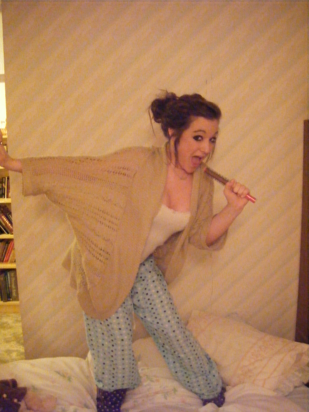
As with the above image, this image conveys a sense of youth and excitement. The pose connotes a sense of fun and a youthful lack of responsibility. However the facial expression on this image is not suitable for a magazine front cover.


 This image is lovely. Unfortunately the lighting has created a yellow hue over the image. This means it is not suitable for a magazine. If the image was without this colouring it would be perfect for the front cover.


This image is ace. It connotes excitement, youthfulness, liveliness and a sense of playfulness I wish to be associated with my artist. This is a strong possibility for the front cover image.
This image is so simple yet so ideal for the double page spread. The image is already split into two meaning that the text would go to the left of the page, the image to the right. Also the photo needs very little doing to it in terms of manipulation.

This is another image that would of been ideal for the double page spread if only it didn't have the yellow hue on the image.

This image is lovely. The composition and lighting echoes the serenity and mystery intended with this image. The fact she is looking away from the camera means that it would be more effective as a poster image. Only a small bit of editing is necessary with this image in order to get rid of the camera lens flare and the mark on the models arm.

The expression on the models face connotes a sense of playfulness that would be more appropriate for a pop magazine. it is for this reason I will probably not make use of this particular image.

Other photos I will use on my contents page are:

I love this image but it does not connote the ideologies and attitudes I wish to convey within my magazine.

One generic convention of Indie music magazines is that the images used do not always present the artist in a serious manner. The image above and the image below are two examples of this attitude, both of wish I will include in my final products.


This image was taken at my friends concert. They had strobe lights in use and the colouring of this image is a result of this strobe lighting. It does however show the singers emotions and would be effective if used on the contents page.

This image is lovely. I decided to make use of the snowy weather as I knew this would make a perfect background for the image. The model is smiling which makes the audience smile too. I will probably use this on my contents page.

As mentioned earlier, I used photos from my friends concert. This is the group that played. I intended to use a full group shot on my double page spread. Unfortunately the lighting and background prevented me from being able to take a successful group shot that was to my pleasing.


Friday, 10 December 2010

Names of Featured Artists

In order to keep to the conventions of my music magazine genre, the names of the featured artists must also connote the ideologies and values that an alternative music magazine gives.
Some possible choice for featured band names are ;

God gave us music

Its too late for Rock and Roll

Outburst

Psychotherapy

Encode

One

Engage

Kings

Katy K

Magazine Name Ideas


The first title I though of was simply 'Rhythm' as this word is strongly associated with music.
Here are some possibilities for the type face I could use if this was the title I was to choose.


Another title I thought of was 'Download'. This suggests that the music featured in the magazine is worthy of downloading. Here are some possibilities of the type face I can use.


Another idea for a title for the magazine 'Pazaz!' Pazaz is unique and connotes excitement. Two elements I wish to portray with my magazine.