These are the most ideal photos taken for my music magazine. The model featured in these images is the 'artist' I will use for my front cover image and double page spread image. I shall also include at least 1 smaller photo of her on my contents page.

This image is simple yet effective. The close up makes the image extremely detailed however the fact the model is looking away form the camera is unconventional for a magazine.

I really like this image. The model is looking straight down the camera lens meaning that it creates familiarity with the audience. The slight smile the model has creates a sense of mystery which entices the reader to pick up the magazine and read more.

I think this image conveys a sense of playfulness that would be more likely to appear within a more pop related magazine as opposed to an indie magazine. It is for this reason that I will not use this image in my final products.

This image conveys a similar sense of playfulness but the attire and body language of the model gives it a bit more edginess. The issue with this image is that it has a lot of blank space on it. this would however make it appropriate for a double page spread. I may consider this image for this element.

As a whole I really like this image. It goes against conventions which is an element often found in Indie or Alternative magazines. It would be more suitable for a poster pull out as opposed to a front cover, contents page or double page spread image.

Again this image would be more suitable for a magazine as the model is central. Her attire suggests an indie musician and the fact she is looking away from the camera would entices the reader to pick up the magazine in an attempt to find out what she is looking at.

This image does not convey the indie attitude I wish to be present in my magazine. It conveys a playfulness and would more likely to be a holiday photo. It does not convey the professionalism I wish to convey.

The positioning of the model in this image is good for a number of reason. Firstly a sense of intrigued is created and secondly the overall positioning means it would be suitable for a double page spread.

I really like the connotations of this image. As a whole the image conveys a sense of rebellion and individualism. These are two ideologies intended within my magazine. This image would be useful for the front cover.

The eye contact made with this image is striking and eye catching. The fact that the eye make up on the model is dark only intensifies this effect.

This image is lovely. The lighting focuses your eyes on the models eyes. The make up used defines and outlines these features creating an elegant look. The coiffed hair and the teddy creates a relaxed childish feel but still with a sense of intrigue and passion.

As with the above image, this image conveys a sense of youth and excitement. The pose connotes a sense of fun and a youthful lack of responsibility. However the facial expression on this image is not suitable for a magazine front cover.

This image is lovely. Unfortunately the lighting has created a yellow hue over the image. This means it is not suitable for a magazine. If the image was without this colouring it would be perfect for the front cover.
This image is ace. It connotes excitement, youthfulness, liveliness and a sense of playfulness I wish to be associated with my artist. This is a strong possibility for the front cover image.

This image is so simple yet so ideal for the double page spread. The image is already split into two meaning that the text would go to the left of the page, the image to the right. Also the photo needs very little doing to it in terms of manipulation.

This is another image that would of been ideal for the double page spread if only it didn't have the yellow hue on the image.

This image is lovely. The composition and lighting echoes the serenity and mystery intended with this image. The fact she is looking away from the camera means that it would be more effective as a poster image. Only a small bit of editing is necessary with this image in order to get rid of the camera lens flare and the mark on the models arm.

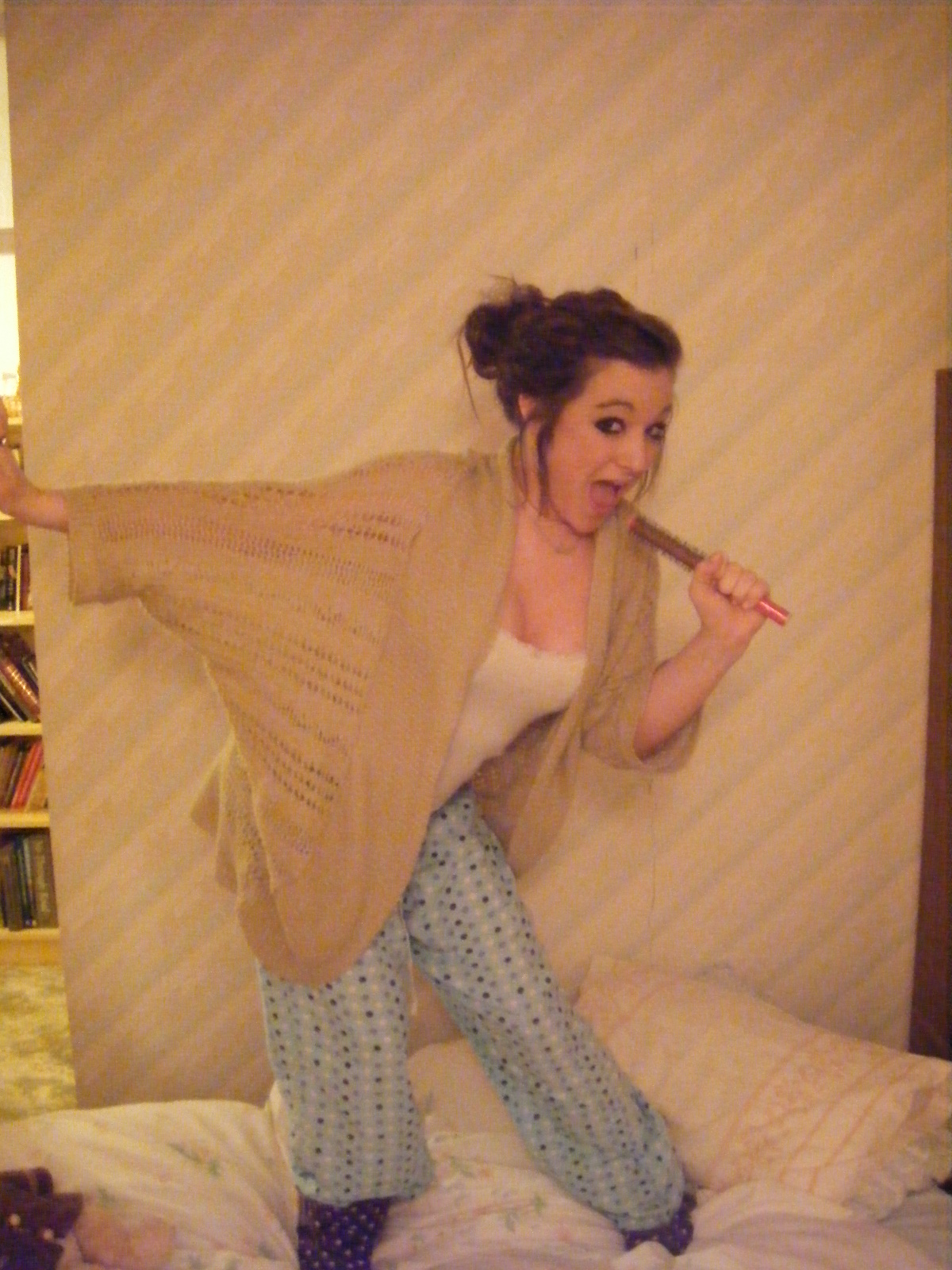
The expression on the models face connotes a sense of playfulness that would be more appropriate for a pop magazine. it is for this reason I will probably not make use of this particular image.
Other photos I will use on my contents page are:

I love this image but it does not connote the ideologies and attitudes I wish to convey within my magazine.

One generic convention of Indie music magazines is that the images used do not always present the artist in a serious manner. The image above and the image below are two examples of this attitude, both of wish I will include in my final products.


This image was taken at my friends concert. They had strobe lights in use and the colouring of this image is a result of this strobe lighting. It does however show the singers emotions and would be effective if used on the contents page.

This image is lovely. I decided to make use of the snowy weather as I knew this would make a perfect background for the image. The model is smiling which makes the audience smile too. I will probably use this on my contents page.

As mentioned earlier, I used photos from my friends concert. This is the group that played. I intended to use a full group shot on my double page spread. Unfortunately the lighting and background prevented me from being able to take a successful group shot that was to my pleasing.
No comments:
Post a Comment